Lens
End-to-End Product Design
Lens is a meditation app I designed for my capstone project as part of Brainstation’s Part-Time UX Design Bootcamp.
As the sole designer, this was my first foray into the end-to-end process of creating a product, encompassing conceptualizing, research, prototyping , and user testing. These efforts focused on learning about the journey of someone looking to get into meditation and designing an experience to help turn them into a lifelong practitioner.
Role
Design Lead
Timeline
October 2021 - May 2022
Scope
Product Design, Research, Interviews, Wireframing, Prototyping, User Testing, Brand Development
Team
Just me!
Design Challenge
Individuals looking to get into mindfulness/meditation practices can be overwhelmed by the number of different techniques that the practice has to offer.
With the recent increased societal focus on mental health, many try to incorporate meditation or mindfulness techniques into their lives to better manage their emotional and mental well-being. Many who choose to practice on their own face frustrations that hinder the benefits of practicing or may lead to the individual quitting. These frustrations include:
Not knowing how to choose the right practice for them
Practicing inconsistently
Not knowing if they are conducting the activity correctly
Feeling bored with their current practice and not knowing what to try instead
How might we enable novice mindfulness practitioners maintain their practice confidently and consistently?
Discovery Phase
Hypothesis
Users who have a more pleasant experience finding the meditation practice that’s right for them are more likely to continue practicing consistently.
Research
Research was conducted to learn about meditation apps and their users. User interviews were conducted to draw insights on how meditation apps help users find and maintain their practice.
Interview participants were chosen based on the following criteria:
Between the ages of 20-35
Practices meditation/mindfulness for upwards of 2 years using meditation apps
The following questions were asked to each interview participant:
Why do you meditate?
How did you learn to meditate?
What techniques do you use?
How long have you been meditating?
What app(s) do you use to meditate?
What practices do you use on that app?
How did you discover those practices?
How has the app helped influence the way you meditate?
What did you like or dislike about the app?
Affinity maps were created to distill the notes of each interview and derive themes and key insights.
Key insights
Some users didn’t like certain meditation apps because they felt “gate-keepy”
Users gravitate to practices that address relevant themes
Users like to learn the “why” and “how” behind the practices that work for them
Many users experience a strong initial motivation to meditate upon picking it up that slowly wanes as time goes on
The general appeal of meditation apps are their curated collection of content that users can browse and have some assurance of quality
Define Phase
Persona Creation
Using insights from the user interviews a persona was created focusing on the novice meditation practitioner, summarizing the target audience’s behaviors, motivations and frustrations.
Opportunity Selection
An experience map was created to draw out areas of opportunities for a solution.
Opportunity was ultimately found in the stages where one would research and try out different practices as this is also where a lack in support would lead to a user to quit.
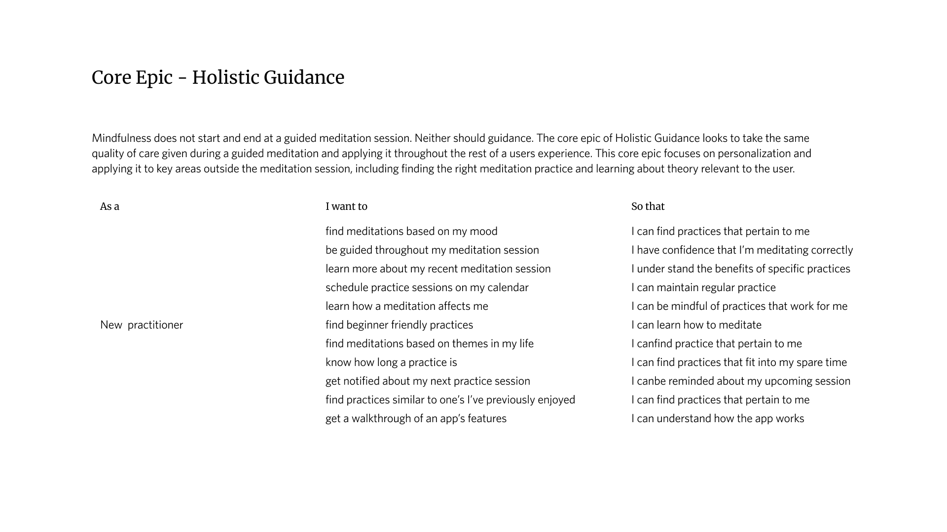
User Stories & Epics
Using the findings in the opportunity selection stage as a guide, user stories were generated and then grouped into an initial set epics.
This set of epics defined the key features and functionalities of the proposed digital product.
The epics were then iterated upon and combined to produce the core epic, “Holistic Guidance”.
Initial set of epics
Education - Learning the theory behind the practice
Guidance - Learning how to meditate
Onboarding - Understanding how to operate the mediation tool
Searching - Finding the meditations that best fits the user
Subscriptions - Managing subscriptions
Tracking - Inputting and viewing progress made through practice
Core epic
Holistic Guidance
Combines different features of the initial set of epics and applies holistically, taking the same quality of care given during a guided meditation and extending it beyond, encompassing the rest of a users experience with the digital product.
This core epic focuses on personalization and using it to assist users in key moments outside the meditation session, including finding the right meditation practice and learning about theory that is relevant to the user.


Task Selection and Task Flow
The task flow was constrained to the end-to-end process of a new user completing their first meditation session.
This was broken into sub tasks and then developed into a full task flow diagram by incorporating functionalities derived from the user stories.
Develop Phase
Concept Ideation/Design
UI inspiration boards were used to draw ideas from existing products. These ideas were developed using hand drawn sketches and then solidified into lo-fi wireframes.
The following screens were focused on as the key screens to develop:
Home Screen
Media Player
Content Library
Mood Check-In
UI Inspiration Board
Design inspiration was drawn from existing popular meditation apps to analyze patterns used for the key screens.
The design choices made on the key screens in each of these products were analyzed were considered for implementation/adaptation into the drawing/wireframing stages of the Develop phase.
Drawings and Lo-Fi Wireframes
Hand drawings were developed based on the ideas cultivated from the UI inspiration board. These hand drawings provided the ability to materialize the layout of design elements and quickly visualize interaction of high level functionalities.
After running through some hand drawings of the main screens, the ideas were then further developed through lo-fi wireframes to be used for testing.
Usability Testing
The scope of testing focused on the following:
Navigability of the app
The understanding of the content/copy
Completing a meditation session
Completing both mood check-ins
The session output document also contained the following tools to decide the chosen improvements:
Task completion table
Design Decision Matrix
3 rounds of usability testing were conducted to receive feedback on the prototype.
Beginning with the lo-fi wireframe, each revision of the prototype was tested and improved upon based on the insights drawn from each test.
A user test plan was created to facilitate the testing and a session output document was created to summarize the results.
Round 1 Insights
The focus for this round was testing the general usability of the prototype to get a sense of navigability of the flow and clarity of the copy.
Global
Testers were able to successfully navigate through then complete their first meditation session
Home Screen
Most users noted that they were unsure as to what the purpose of the journey section was
Mood Check-In
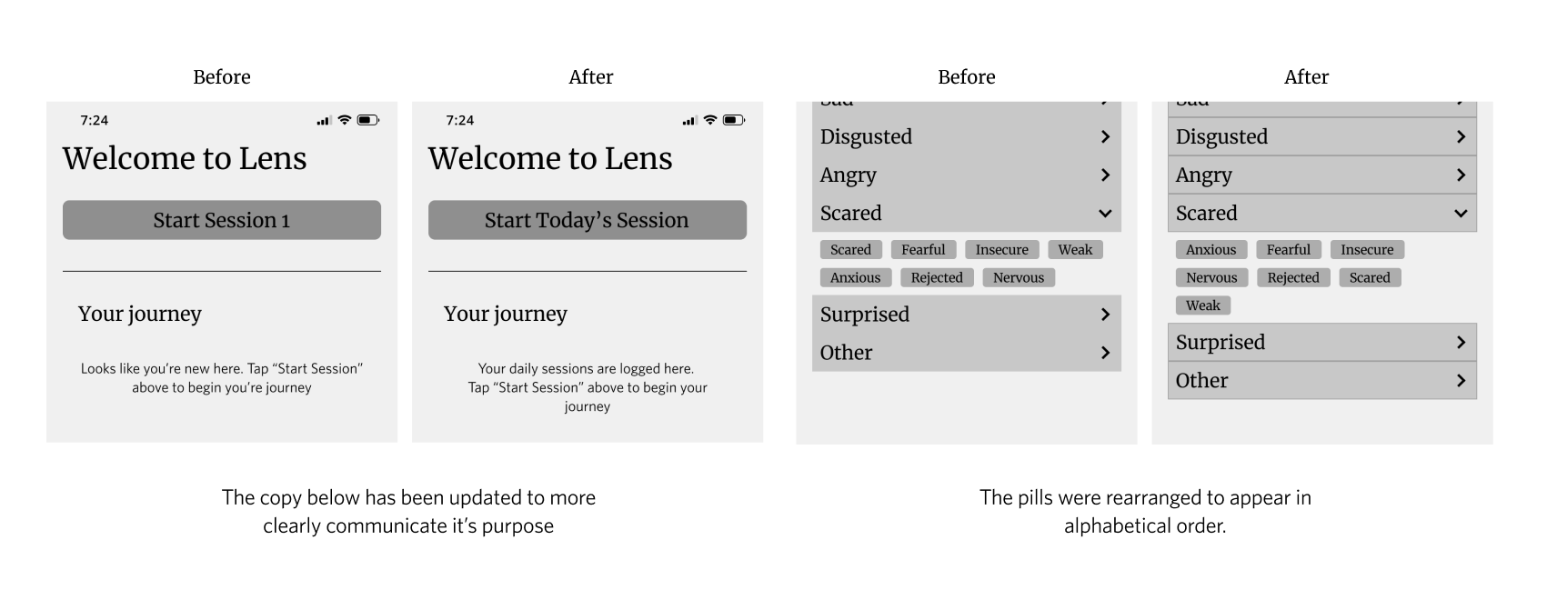
Many users had difficulties finding specific emotions without the search feature due to being unsure as to which drop-down category they may possibly be stored
the sequencing of the pills within the mood check in buckets were not intuitive
Some users were not immediately aware that the mood check-in used an accordion menu pattern
Session Completion Page
Some testers felt confused about the themes and techniques section on this screen
Some were unsure as to if they related to the day’s sessions
The findings were then formed into potential design improvements which were plotted onto a design decision matrix for prioritization.
Round 1 Improvement Highlights


Round 2 Insights
This round of testing focused on measuring the success of the first round of design improvements.
Home Screen
Beginning the session was seamless
having a section of the recently completed session’s themes on the home screen may be useful for people who may not have time to look at them immediately after completing their session
Adding a preview of the next session after completing today’s session may be useful for for users
Intro Cards
Intro cards are welcoming but wordy
One tester noted that a page indicator would be useful
Mood Check-In
Mood categorization still confused most testers on first impression
having an pre/post meditation indicator would be useful
one tester indicated that they thought they went back to the initial mood check-in screen after listening to the audio
On-boarding
on-boarding was helpful to all testers
The Audio Player
“simple”
“doesn’t distract from from the activity of meditation”
Session Completion Page
The tone and animation “Hits the nail on the head for the feel of a meditation app”
Additional Features
One tester noted that a notes section may be useful for users looking to log their experiences
also acts as another avenue for the app to collect data
The findings were then formed into potential design improvements which were plotted onto a design decision matrix for prioritization.
Round 2 Improvement Highlights


Round 3 Insights
Due to the significant shift in the functionality on the mood check-in process, this round focused solely on the usability of the new mood check-in wheel and it’s on-boarding screens.
Mood Check-in Onboarding
Instructions
The instructions were clear to testers
Gave testers a clear idea on how to use the mood check-in wheel
Navigation
Most testers had issues figuring out how to advance the onboarding screens due to the copy blending into the background
Mood Check-In Wheel
Testers were able to maneuver the mood check-in wheel
The aesthetic of the mood wheel was well received
Some testers noted that the layout of the descriptors on the wheel made it so that they had to tilt their head when trying to read some of the words
The intent was to allow users to rotate the wheel to mitigate this, however Figma lacked 2-finger gesture usability on their prototypes at the time which prevented this functionality
A few testers noted that the number of choices immediately presented to them was overwhelming
Due to the minimal volume of proposed changes, no design decision matrix was used. The design improvements implemented were catered to making the mood check-in on-boarding screen navigation more clear.
Round 3 Improvement Highlights

Deliver Phase
Brand Identity Story
The identity of the meditation app was based off a list of descriptors that would inform the aesthetics and ambiance.
The following descriptors were used to direct the intended atmosphere and tone of the app:
Personal
Stillness
Open
Grounded
Welcoming
Reflection
Product Name Selection
A list of potential names for the product was created based on the descriptors generated.
The aim was to create names that specifically brings out a welcoming tone and focuses on the theme reflection.
The list below shows the final 3 names to potentially use for the meditation app:
Re-flect
Lens
Window
Ultimately, the name “Lens” was selected due to the app’s themes of developing awareness, focusing inward, and obtaining clarity.
Moodboard
The descriptors were then used to help develop the app’s name was used to generate a moodboard.

Colour Palette Development
The colour palette below was derived from the moodboard shown in the previous page. Prior iterations of the palette were improved upon by applying the palettes to the wireframe and tweaking elements based on clarity and aesthetic cohesiveness. The final iteration used is shown below
Typography
The image below shows the typography used through the app. The combination of Merriweather and Whitney was selected to evoke clear a sense of studying one’s self, and was meant to mimic a book as if to communicate to the user that the app is used as a personal journal to log their mental and emotional growth.
Wordmark Development
The wordmark was developed using the same base typefaces used in the app. The refinement stage encompasses the exploration of different fonts and representations of the font’s form. The chosen form was selected and then altered to allow for even spacing between each letter.
App Logo Development
The ideation process of the logo design attempted to establish ideas combining to the function of the app and the themes related to the name of the app. The refinement process aimed to incorporate the “eye” pattern used as part of the graphics in the prototype. Ultimately, the eye graphic on its own was selected with slight adjustments.

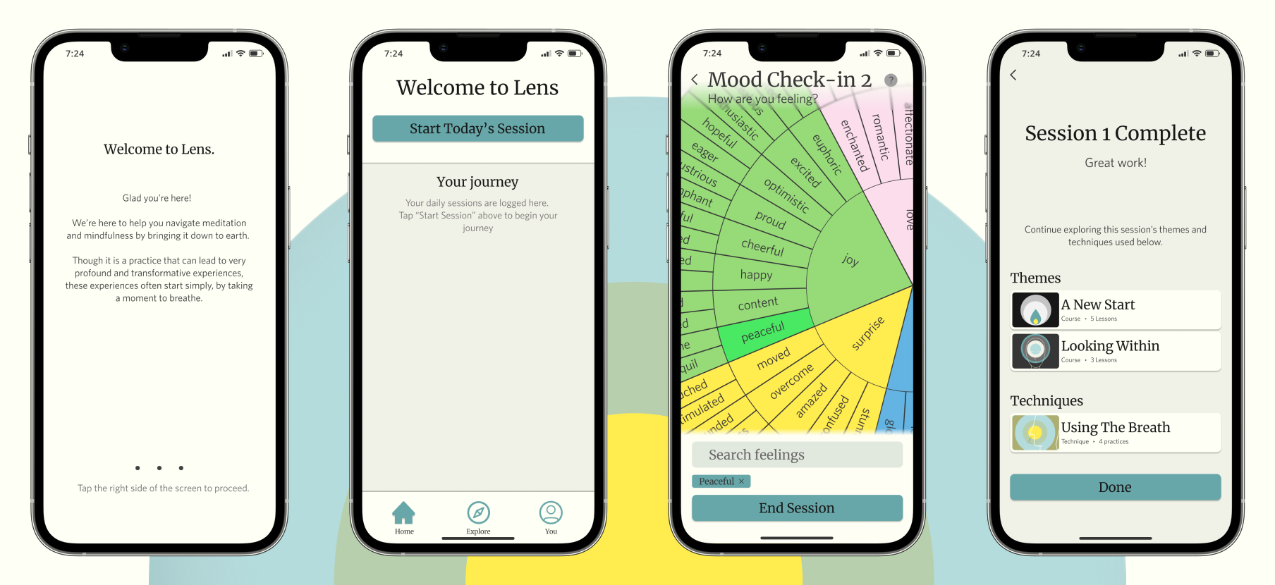
Hi-fi Mockup
The design system was then applied to the latest revision of the wireframe resulting in the hi-fi mockup of the product.
See hi-fi prototype here.
Design Impact
The goal of the design was to help users find the meditation practice that’s right for them.
The idea was to create an experience that compels the user to be more mindful of themselves while helping the app cater meaningful content to them.
The result of this project was a good start.
Execution
The method of execution was focusing on incorporating tools that are present in current meditation apps into the process of completing a meditation session.
The hypothesis was that incorporating these tools into the common flow of searching and selecting the session’s meditation would enhance the practice and help the user in their goal of living mindfully.
Initially, several different interactive features were considered to incorporate into a user’s practice session:
A section to log how you feel (mood check-in)
A notes section to record any notable moments in your day or mind
A “choose your own adventure” style of daily questionnaires to that determines meditation practice
Ultimately, due to time constraints, only the mood check-in was selected to develop as part of the practice session.
Reception
Feedback from user testing revealed that the overall process was smooth and intuitive. In terms of achieving the design goal, the added functionality of the mood wheel did prove to be an interesting feature to users looking to dig down to the core of their emotions.
However, the feature did pose some problems that could not be addressed within in timeline of this project. Visually, the mood wheel is an attractive element for one to explore their emotions. But functionally, it can be intimidating to maneuver. The wheel contains a large amount of descriptors that can be difficult to sift through on a small phone screen and, due to the shape of the wheel, may be displayed at awkward angles require reorienting of the mood wheel.
This experience could lead to users to be stuck focusing on how to use this feature instead of using the feature to help focus on themselves.
Conclusion
The final iteration of the project proved to be a good concept to expand on. Immediate iterations should focus on iterating on the mood wheel functionality to resolve the issues found in the final prototype.
Future Roadmap
The next steps focus on adding and improving functionalities that further promotes mindfulness in the user.
Iterate possible alternatives or extensions to the mood wheel
The largest challenge of this project was trying to find a pattern that would best fit the functionality of the mood check-in process
The current design displays a large list of descriptors to the user which may overwhelm them and distract the user from the main goal of invoking introspection.
Ideate additional features to incorporate into the practice session
Like the mood check-in feature, it must engage the user to act thoughtfully while helping the app learn what content would assist in reach their goal
One possible example that was suggested during user testing is an optional notes feature that one can use to log ideas or moments that are top of mind, possibly informing why they’re feeling a certain way and what practice could be useful to them in that moment
Key Learnings
This project proved to be an excellent experience of discovery as I took in the principles taught in class and applied them towards creating a digital product.
As a newcomer to the UX design world, this project exposed me to the challenges that designers face when trying to create a brand new product and the processes used to overcome them.
If I were to do this again I would…
Add in user interview questions that learn about what one’s expectations were when they began practicing meditation
The current list of interview questions helped me obtain insight into the meditation habits of new users. One of the goals of the design was to demystify meditation to be more approachable for more apprehensive users. However, I realized that none of the questions I asked probed into the moment in one’s journey where they went from knowing little about practicing to practicing frequently.
The answer to those questions would help provide insight to what makes turns a new practitioner into a lifelong practitioner and inform feature to how an app could support that journey.
Went back to the drawing board upon finding repeated issues with the mood check-in process
During testing, users resonated with the purpose of the mood check-in functionality but had issues with understanding why some descriptors fell into specific categories. This problem persisted even after a layout overhaul of the process.
With this new knowledge, I would go back to the drawing board to look into generating sketches to address this information architecture problem.
Implement more rounds of user testing with a more focused scope
To support the previous point, I would add in more rounds of focused usability testing that are similar to the format of the third testing round of this project. In doing so it would allow me to test more design iterations, helping obtain more insights in a shorter period of time.