DDF vs POS Report
Process Improvement

The DDF vs POS report is one of many excel spreadsheets that are generated daily to help Forecast Analysts (FA’s) conduct their tasks.
For this project, I took it upon myself to understand how FA’s for a retail company were currently using this report to find opportunities to better cater it to the tasks it supports. By interviewing FA’s across all divisions of the company, I was able to inform changes to the layout, making the report more navigable and easier to maneuver.
Role
Design Lead
Timeline
February 2023 - March 2023
Scope
Research, Prototyping, User Testing, Implementation
Team
Just me!
Background
FA’s spend the majority of their time in various reporting in order to draw insights as well as conduct their regular tasks.
For the most part, these reports aren't tied directly to any particular task as per some Standard-Operating-Procedure and because of that much of their time is spent distilling the report to get to the relevant information needed to complete their task.
Design Challenge
Despite having the same tasks with desired outcomes, the methods used by each FA to achieve them can differ due to various reasons.
As such, two different FA’s regularly using the same report to complete the same task may rely on different sections to get the job done.
Despite this, I wanted to understand if there was a commonality between how FA’s of different divisions of the company use the DDF vs POS report and if there were opportunities to improve the report to better fit all of their work flows.
How might we optimize the presentation of the DDF vs POS report to better assist FA's across all businesses in their forecasting duties?
Researching
What did I want to know?
In my research, I wanted to understand what people were doing in the report and how they were doing it.
Breaking it down, this meant answering the following questions.
What are the primary use cases of the report?
ie. use cases tied to FA accountailities
What are the secondary use cases?
Less common variations on primary use cases
use cases tied to ADHOC requests
Are there similarities in how different FA’s use the report for the same use cases?
How did I go about it?
To confirm these question, I conducted was in the form of user interviews where I interviewed at least 2 FAs from all divisions of the company. I then presented the findings to their managers to help inform design decisions.
For each interview, I broke it down into qualitative and quantitative segments
Qualitative
For what use cases do you use this report?
Could you walk me through how you use the report in these use cases?
Quantitative
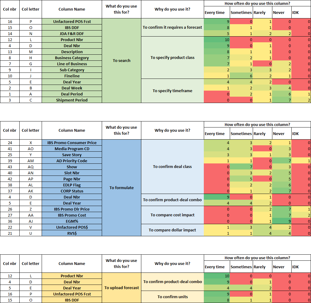
How often do you use this column when in you open the report?
Column-by-column, FA’s were asked to respond from a range of “Every time” to “Never”, to which the responses were plotted on a heat map.

Full column usage heatmap. “IDK” accounts for FA’s who noted that they don’t know what that column is for
Key Findings
84% of FA’s interviewed use the report in some capacity
All FA’s who stated using the file mainly do so for the same 2 use cases
Out of the 54 columns present in the report, 33 columns are reported by 50% or more FA’s to never be used
15 of which were reported by all FA’s to never be used
Define
The main use case(s)
Across all FA’s who stated relying on the report, the 2 primary use cases noted were the following:
Identifying deals that need don’t have a forecast yet
Conducting large scale forecast changes
After asking the FA’s to walk me through how they complete these tasks, I noticed that the specific steps taken can vary greatly. For example, some FA’s may solely rely on this report to complete these tasks while other FA’s may supplement the use of this files with other tools or reports. Regardless, I noticed that both use cases fall within the same process flow of forecasting a product shown below.
To account for the the different variations, I thought about the different views an FA would need at each stage of the process and noted the columns that are referenced at each stage of the process.
The secondary use cases and further considerations
Aside from the main use cases stated above, some FA’s also stated using this report for the following:
See how orders are actualizing leading up to an upcoming deal
Referencing total costing of a deal’s forecast
These tasks were mentioned by FA’s as being conducted rarely, since they only do when asked by a manager.
Furthermore, despite being a geared towards FA’s, I was asked by the Forecast Managers not to delete 3 of the 15 unused columns, mentioning that they may be used by crossfunctional teams.
The Current State Report
Connecting the report to the research findings
One finding that I noticed during the interviews was that, when conducting their forecasts, many FA’s tend to repeatedly scroll left and right to access different columns of information. To minimize this, some FA’s hide columns they don’t tend to refer to in order to fit as much of the most relevant information then need onto their screen.
To help me visualize this, I’ve noted which columns are typically used in each stage of the main process. I’ve also added in a view of the columns that aren’t used, the columns I’ve been asked not to delete in the final redesign, and the columns used for the secondary use case.
Developing a hierarchy of information for the main use case
When reviewing the columns used in the main process flow, I found that there was a wide variability of usage between FA’s, both in what is used and how often each column is used.
To better understand this, I further broke down the columns involved in each step into sub-categories based on why they’re used to see what needs to be more readily accessible to FA’s.
Design Goals
Delete unused/redundant columns
Redesign the default view such that it streamlines the main use cases
Ensure the redesigns also accommodates accessible information needed for secondary use cases
The Current State Report
Develop Phase
Deleting the unused columns
The first step of cleaning up the report was removing the columns that FA’s indicated never using. This reduces the total potential eye travel throughout the report as well as the panning required to reach the last column.
Applying the hierarchy
The next step was to look at the columns used in the main process flow and rearrange them based on the main process flow, aggregating the columns by their sub-category of usage if necessary.
Ignoring the secondary columns, I’ve iterated through several revisions to make sure that columns that are referred to most often are regularly in view, in the process, also grouping columns by their level of usage.
There were a few exceptions made when grouping the columns. One exception is the green column shown in the far right of the redesigned iteration. This column is used far less in general and didn’t directly relate to any other columns used when searching. So to prioritize center screen to columns that are used more often, I positioned it in the far end.
Another exception is the “Description” column that separates the columns used in the uploading step. This was kept to the right of the “Product Nbr” column as these 2 columns are commonly shown as such across all reports that FA’s use and, as such, are used to reading.
In applying the hierarchy to the design, I’ve created a clear visual flow to the information presented that supports the main process and keeps the most relevant information in view.
Consolidating the main view
At this point, an issue I found with the last iteration was that, despite keeping the most used columns together, it separated columns that relate to each other in some cases.
To get around this, I wanted to see if I could leverage the “Group Column” functionality, a function that hides columns but allows the user to expand them with a click of a button. This would help compartmentalize like columns together while maintaining the option to hide them if needed.
This allowed me to create a consolidated single screen view, with no columns bleeding outside of the screen. This especially helped compartmentalize the lesser used columns during the formulating stage.
I also took this as an opportunity to incorporate columns used for the secondary use cases, as well as the columns I was asked not to remove from the final report.
For columns related to orders actualizing, I’ve positioned them by the unit columns so FA’s can reference the orders vs their forecasts. As for the costing columns, I’ve placed them by dollar columns since they’re the closest related. The remaining columns were grouped by the end of the report to prevent FA’s from accidentally expanding them.
The resulting changes
The changes up to this point allowed for a single screen default view with no columns bleeding outside of the user’s screen. This leaner view of the report limits the need for the FA to scroll back and forth to access the most commonly used areas of information while giving them the option to access lesser used information when required.

An overview of the report at this point, each grouping button hides the following lesser used information:
Lesser user timeframe related columns
Actualized orders for upcoming deals (secondary use case)
Costing information (secondary use case)
Lesser used price information
Out of scope columns
Delivering the end product
Polishing up the headers
In this stage of the process, I looked into cleaning up the header labeling and looking into other opportunities to improve readability of the report. I’ve improved the outdated labels and then applied a colour fill to differentiate separate sections of the report.
To minimize the amount of colours used, I’ve only decided to highlight the following sections:
The columns used the most to identify the product/deal in orange
Forecasted units and dollars in green
Deal class information
The columns containing hidden information were filled in with a lighter tint of their most relevant adjacent column. The remaining columns were left at their default grey colour to further emphasize the highlighted items.

The final state report
Future Roadmap & Key Learnings
The next steps focus on working with internal teams to create and distribute the report.
In speaking with the team that distributes this report to FA’s, they mentioned a few roadblocks in regards to generating the report. I will be speaking with them to see how we can work together to get around those roadblocks.
Developing a deeper understanding of how to apply the design process
Prior to this project, I’ve not yet had the chance to apply my knowledge in the design process towards projects outside of developing an app. Approaching this process improvement project as such helped me understand how this process applies in broader applications.
Avoiding missing the forest for the trees
I initially expected to redesign the report based on a precise and extensive flow diagram. However, as I interviewed more and more FA’s on how they conduct their work, I realized that I needed to zoom out to a generalized process as designing towards one’s more specific work flow will alienate others, making it harder for them to adjust to the redesign.