Discord
Heuristic Evaluation and Process Redesign
Discord is a voice, video, and text chat application that my project partner and I examined as part of our heuristic evaluation assignment for our UX design bootcamp.
As a team, I, along with my partner Melina, focused on analyzing a specific process in the iOS version of the app, flagging issues based on the Neilsen Norman Group’s 10 usability heuristics. Any issues flagged were plotted on a design prioritization matrix comparing the impact to the app’s usability vs the effort required to implement a fix. Process redesigns were then proposed to solve issues that had the highest impact to user experience with relatively low effort to implement. The goal of this assignment was to take our findings and proposed solutions and assemble them into a report.
Role
Co-Designer
Timeline
2 weeks
January 2022 - February 2022
Scope
Huerisitc evaluation, process redesign
Team
Melina Querel and myself
Design Challenge
For this assignment, we were asked to evaluate the usability of an existing digital product by conducting a heuristic evaluation and then proposing a process redesign to resolve any issues found.
Methodology
The digital product was evaluated using the 10 Usability Heuristics for UI design developed by the Neilsen Norman Group show below:
1. Visibility of system status
2. Match between system and the real world
3. User control and freedom
4. Consistency and standards
5. Error prevention
6. Recognition rather than recall
7. Flexibility and efficiency of use
8. Aesthetic and minimalist design
9. Help users recognize, diagnose, and recover from error
10. Help and documentation
Each issue found was assigned a severity rating on a scale from 0 to 4 based on the issue’s impact on usability:
I don’t agree that this is a usability problem at all
Cosmetic problem only: need not be fixed unless extra time is available on project.
Minor usability problem:fixing this should be given low priority.
Major usability problem: important to fix, so should be given high priority.
Usability catastrophe: imperative to fix this before product can be released.
Discover Phase
Task Selection
Through experimentation in the app, I decided to distill our scope to creating a server. Creating the server can be broken down to the following items based on Discord’s requirements:
Create a server
Add friends to server
Send a message
The sequence of steps selected assumes that the user partially completes the requirements through the initial server setup wizard and then uses the CTA in the server’s default text channel. We did so in order to cover the main areas that users would interact with in order to set up their server.
Our goal was to comb through each screen in this process to find aspects of the design that violated the 10 Usability Heuristics for UI design and propose design improvements to address them.
Define Phase
Evaluation
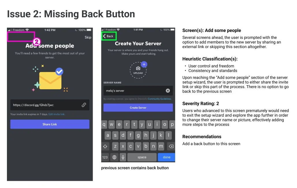
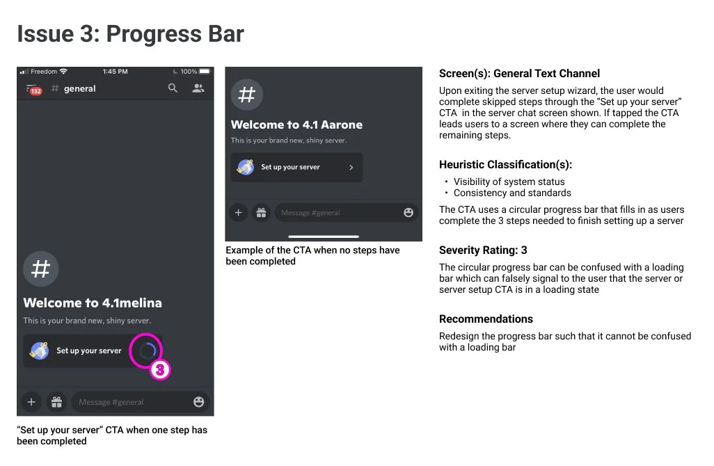
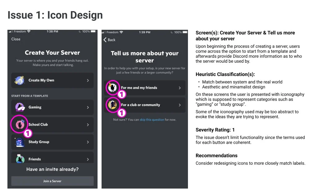
The pictures below show the screens which were flagged for violating the usability heuristics and their corresponding severity ratings:

Design Prioritization
The issues were plotted onto a design prioritization matrix to facilitate which issues to address.
Given time constraints we prioritized the issues that had the most impact on usability relative to the effort required to implement the solution, shown in the top right quadrant of the matrix. Following that, high impact, high effort issues are considered and then low impact, low effort items.
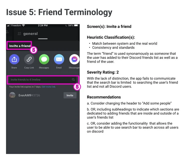
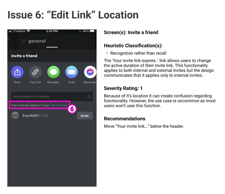
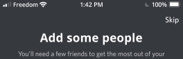
Conducting this exercise resulted in focusing on the “Add some people” screen, the “Set up your server” CTA and the “Invite a friend screen”, I focused solely on the “Invite a friend screen”.
Develop Phase
Improving the “Invite a friend screen”
The invite a friend screen had the following issues:
The header bar colour is too dark and can blend into the dimmed background behind it
The use of the term “friend” on this screen can be confusing to the user, particularly in regards to the functionality of the search bar. The page can imply that the search bar can be used to search across all Discord users when in actuality it is limited to one’s friends list.
Lastly, the position of the “Edit invite link” feature may communicate to the user that the settings within it apply only to internal invites.
My goal is to propose solutions that would address these issues and improve the experience of navigating this screen.
Exploring Solutions
I created mock-ups of redesigns to visualize potential solutions to the issues found during the evaluation. In particular, I tried to pay attention to the hierarchy of the information displayed on the screen and how it communicates functionality to the user. On this screen I played around with the position and format of the “Edit invite link” functionality and the copy on the screen, drawing inspiration from other popular apps the desktop version of Discord.
Deliver Phase
Digging into the header
a. Changed title of header bar to “Add some people” to maintain consistency with previous screens
b. Relocated drawer bar indicator from outside of the drawer to within to more clearly define drawer boundary. This pattern can be seen in other commonly used apps (i.e. Instagram)
c. Changed header bar background colour to match background colour of the body. The change is consistent with the desktop version of the same screen.

Improving the body
a. Changed copy inside of search bar to read “Search your friends list” to communicate precise functionality of search bar and prevent users from trying to use it to search across all discord users
b. Relocated “Edit invite link” to the bottom of the screen and implemented it as a footer bar. The intent is to maintain visual balance with the header bar, improving functional hierarchy, and better communicating that the edit invite feature applies to both internal and external invite links. The font size stayed the same to avoid drawing too much attention to the footer given that most users inviting people to the server won’t use this feature.
Overview
Next Steps & Key Learnings
1. Leverage lo-fi wireframes for solution ideation
During the Develop phase Melina and I generated potential solutions at a med-fi level, applying Discord’s styling on every iteration. Though this was great for practicing our skills in Figma, fixating on the styling details at that point consumed time that could be more efficiently used generating macro-level iterations. For next time I would use lo-fi wireframes at that point to expedite exploration of potential solutions and then apply the styling after the high level structure has been solidified.
2. Test and iterate on the proposed solutions
The scope of this assignment excluded testing as part of the process. If I were to do this again I would introduce testing after compiling the initial ideas into a lo-fi prototype or after the final mockup was created. Regardless, user feedback would need to be collected to verify if the design interventions were successful.